
12 Jun Google’s Mobile-Friendly Update & What It Means for Your Business

Congratulations! You made it through “Mobilegeddon”, Google’s algorithm update which now considers mobile-optimization as a part of its website search rankings.
The much-anticipated change took place on April 21st, following months of panic on behalf of SEOs, small businesses and corporations trying to quickly master their site’s mobile experience before its traffic plummeted and all was lost.
When the update was said and done, however, very few webmasters even saw a noticeable change in rankings. So how did the mobile-friendly update actually effect Google’s search algorithm, and what does this mean for your business’s website in the future?

The New Algorithm
First off, I want to mention that the update only applied to searches made on mobile devices (tablets not included- for now), so the same keyword will now yield different results on mobile than on desktop. If your website pages already have a well-optimized layout on phones, your rankings were probably boosted on mobile searches. If your pages have not been optimized for smaller screens, your rankings were demoted.
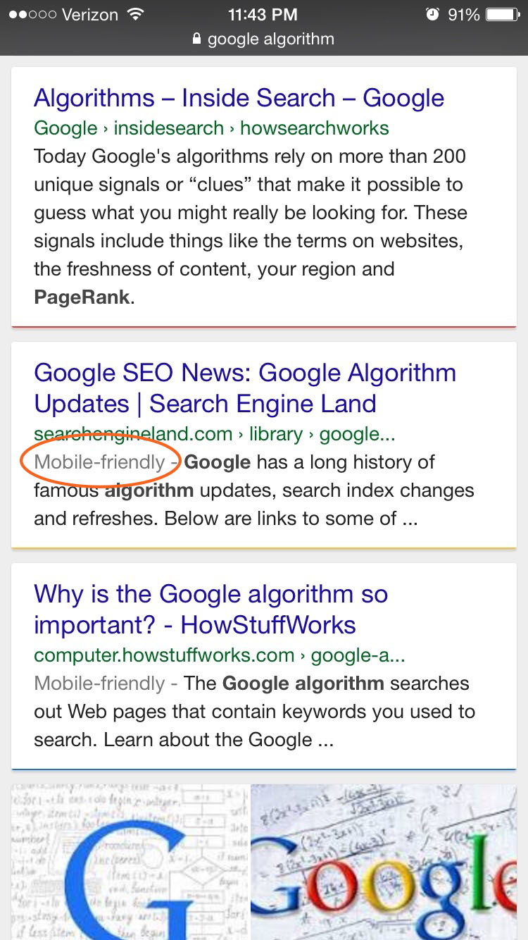 In addition to the change in algorithm, Google also introduced a new “Mobile-Friendly” label to its results to inform mobile viewers of the pages that’ll be easiest to navigate.
It’s important to keep in mind that, although mobile-friendliness is now a factor in SEO rankings, it is not the most significant. Google still examines content, website structure, page speed, links, and other signals when determining search results- the reason that so few websites had a noticeable change in placement post-mobilegeddon.
Planning for a Mobile Future
Whether your website rankings dropped or not, one thing is for certain: Google is getting serious about quality user experience. And other search engines, such as Bing, are following suit.
To avoid falling behind as search engines keep updating their algorithms (and to provide the best user experience possible), the following issues need to be addressed on your website:
Accept that mobile devices aren’t going away.
More and more different screen sizes are being used to browse the web. If your website isn’t already optimized for mobile, it is time for an update! To ensure that ALL your visitors have the best experience now and in the future, a responsive design is the way to go.
Not sure if your website is mobile-friendly? Google Webmaster Tools lets you test your entire website or test the individual pages and provides feedback on what you could be doing better.
Avoid common mobile mistakes.
Believe it or not, there are quite a few! Some of them, such as using Flash videos, were once a common practice in web design. Others are a byproduct of poor or outdated development. Check out Google’s list of common mobile mistakes to make sure that your mobile approach passes the test.
Minimize loading times.
Website speed should always be a concern, since most web visitors are too impatient to wait for pages to load. Even though speed is already considered in SEO rankings, Google now seems to be testing a “Slow” label to warn users of longer-than-average loading times. If released, this will appear next to search results like the new “Mobile-Friendly” label does, and will likely deter users from clicking into your website.
In order to succeed in today’s marketplace, businesses need an effective and thorough web strategy. For more information on optimizing your website for mobile, see any of the links below:
Sorry, the comment form is closed at this time.