21 Jan The Theory Behind Color Schemes
Colors are the building blocks of your brand, deciding how customers think and feel about your business on a subconscious level. Because of this, most designers use color theory- the science behind emotional reactions to color- in order to create color schemes that will actually support businesses in their marketing efforts.
But color theory is an incredibly vast topic, even when just applying it to branding and website design. So let’s explore the concept on a basic level, to better understand how the theory applies to creating an effective color scheme for designing a brand’s materials.
What is Color Theory?
Color theory is used to give structure and guidance to the art of working with and combining colors. We have benefitted from a wealth of art history and science that has shaped the principles designers use today to effectively combine and utilize colors. Without color theory, it would be impossible to create excellent designs that convey the proper intent to your audience.
Using the Color Wheel:
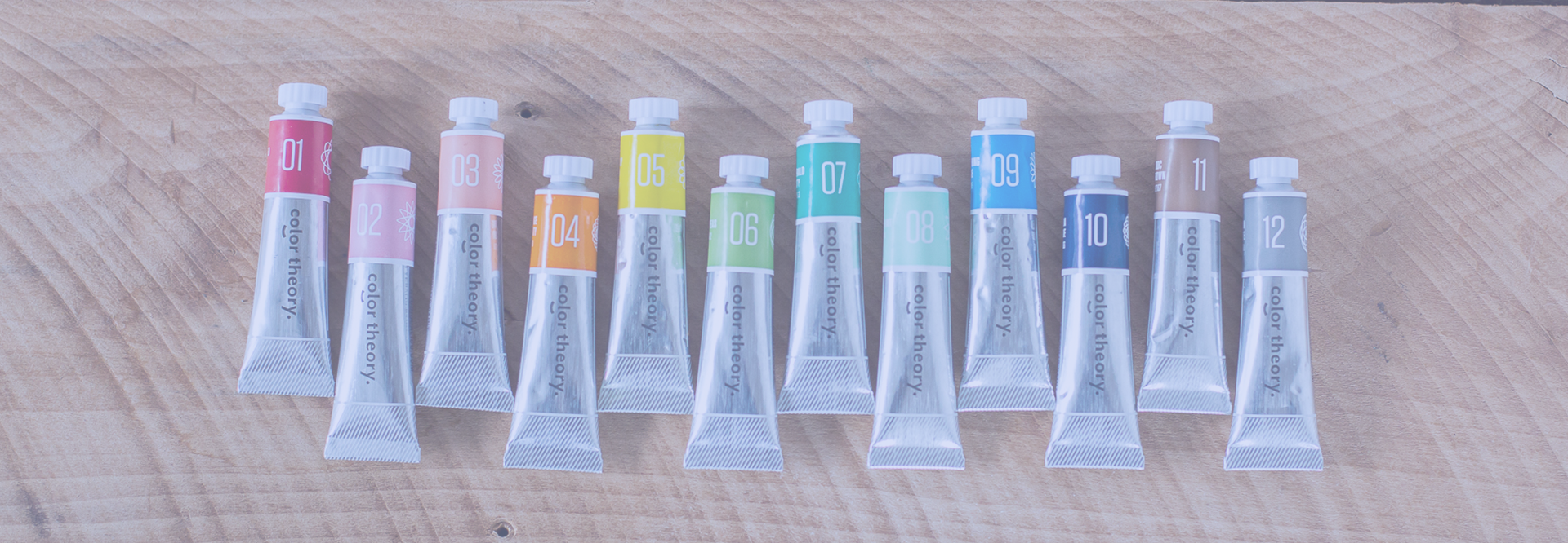
When thinking about what colors will be used within your business, it’s important to select an appropriate color palette. This will not only create a harmonious design with colors that flow well together, but will help keep the colors consistent throughout everything you do.
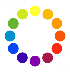
In most basic art classes, designers are introduced to the color wheel that represents a spectrum of colors (also known as hues). The color wheel is created using the three primary colors (red, blue and yellow) and their combinations.
Creating Color Schemes from the Color Wheel:
In order to create an effective palette from within the color wheel, designers are taught basic patterns that connect multiple colors together in different ways. These color combinations are called complementary, triad, split complementary, tetrad, analogous, and monochromatic.
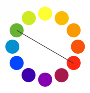
Complementary
Complementary colors are essentially two colors that are opposites. They have the highest contrast between each other, and neutralize each other when combined (creating a gray). You can see this visually with any two colors on opposite ends of the color wheel.
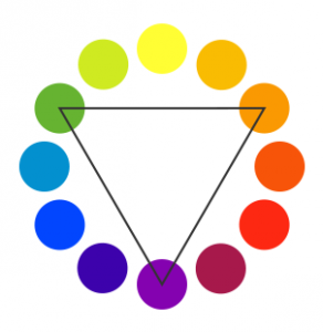
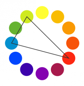
Triad
Triadic color schemes are made up of 3 colors evenly spaced out on the color spectrum. This is done by creating an equilateral triangle on a color wheel from your chosen base color.
Split Complementary
A split complementary color scheme is similar to complementary colors. It is comprised of a base color (red) and the two adjacent colors to the base color’s complementary color.
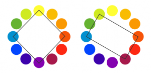
Tetrad
Tetrad color schemes are made of two sets of complementary colors. This can be done rectangularly when the two sets of complementary colors are close together, or evenly distributed on the spectrum as a square.
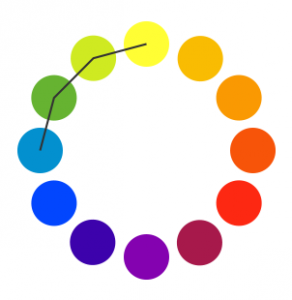
Analogous
An analogous color scheme is made up of colors on the spectrum that are next to each other. Often this kind of color scheme creates harmony due to the rhythm of the similar colors.
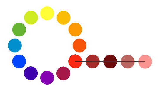
Monochromatic
A Monochromatic color scheme is made up of one color and adding various tints, shades, and tones. A monochromatic color scheme is often known for being calming.
Color Psychology:
When thinking about what color scheme to use for your brand, it’s important to consider what the colors say about you, your industry, and your product. Studies on the psychology of color have created a general understanding of the impact that different colors have on emotional responses, helping designers choose the best options for businesses every time.
That being said, we must keep in mind that the meanings of colors are are subjective, and will vary from person to person and from culture to culture. This is why it’s important for us (and other design teams) to have an in-depth understanding of your target audience before starting to design for your business.
There are an excellent number of resources online about the many meanings of colors, but here a some general guidelines:

Green: Earthy, Growth, Reliable
Blue: Trustworthy, Calming, Cold
Purple: Creative, Wealthy, Royal
Red: Bold, High Energy, Aggressive
Orange: Warm, Social, Enthusiastic
Yellow: Fun, Happiness, Wisdom
Brown: Dependable, Honesty, Friendly
Black: Powerful, Authority, Sophisticated
Gray: Neutral, Stability, Subdued
White: Pure, Clean, Simple
Fawkes FX is a creative digital design studio based in Portland, OR. We are dedicated to helping businesses reach their full marketing potential, specializing in branding, photography, animations, and website development to make it happen. If you feel as though your business could use a creative boost, we’d love to give you a hand!
Sorry, the comment form is closed at this time.