
18 Feb What Is Responsive Web Design?
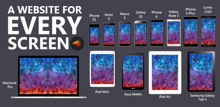
Our world relies on mobile devices. Between smartphones, laptops, tablets, and “phablets” there is a never-ending parade of new devices released every year, each with their own unique sizes and capabilities.
But with this growing variation in screens and resolutions, web developers are faced with a challenge: making websites that can be easily used by any mobile device, now and in the future.
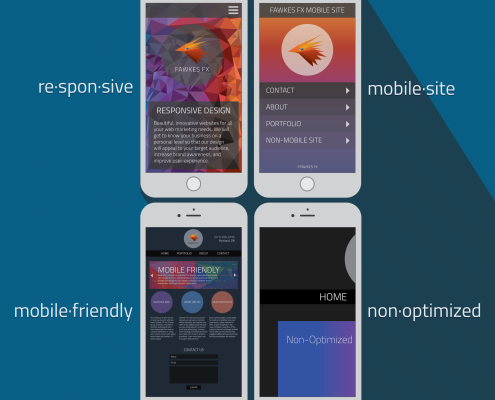
Responsive design is the solution to this problem. Instead of building the same website in different sizes to suit every possible device, a responsive website will adapt to the screen it’s being viewed on.
Even though desktop users see the widescreen layout and mobile users see the single-column layout, a responsive website runs on a single code. This is done through the use of fluid grids and flexible images, morphing the contents to create the best user experience possible on every device.
Mobile-Friendly is NOT the Same as Responsive
But it really depends on who you ask. Mobile-friendly is a term with many different definitions; to “old-school” web developers, it simply refers to websites accessible by mobile users, which only excludes those with Flash videos, Java or other non-compatible coding languages. These versions of mobile-friendly sites are often displayed at a much smaller size, making it difficult to read text or select buttons without zooming in (as shown in the image).
 Google’s standards for mobile-friendliness are a bit higher, requiring that the website:
-is readable without zooming
-does not require horizontal scrolling
-has properly sized & spaced buttons for finger tapping
-avoids unplayable content
Another option is a mobile website, in which a separate layout is built specifically for mobile devices. When a user tries to access the site on a mobile device, the web detects the origin and loads the alternate HTML code. But while a simplified version of the full site makes it easier for users to navigate the options, this comes at the expense of good design and thorough content.
Unlike responsive designs, however, mobile-friendly layouts and mobile websites will not adjust to fit the specific device viewing them. These platforms are built as one-size-fits-all solutions, meaning that any mobile screens larger than the intended size will distort their appearance.
Curious to see how your website appears on various screen sizes? Test this out at http://responsivedesignchecker.com/
Facts about Responsive Web Design
Still not sure whether responsive design is the best decision for your website? Here are a few things to consider:
1. As of 2015, more than 9 common screen resolutions are used across mobile devices, but none hold over a quarter of the total market share. (Hobo) [Tweet This!]
2. More Google searches take place on mobile devices than on computers in 10 countries, including the U.S. and Canada. (Google)
3. Nearly half of consumers say they won’t return to a website if it doesn’t load properly on their mobile devices. (The Social Media Hat) [Tweet This!]
4. Google recommends responsive design over other development techniques, as this structure helps achieve better SEO value more quickly and efficiently. (Google)
Sorry, the comment form is closed at this time.